PLATFORM ZERO:
ENTERPRISE 5G ANALYTICS
Transforming nationwide 5G performance data into an actionable geo-spatial command center. Enterprise network analytics dashboard for real-time SINR, RSRP monitoring, and intelligent coverage optimization across Verizon's national infrastructure.

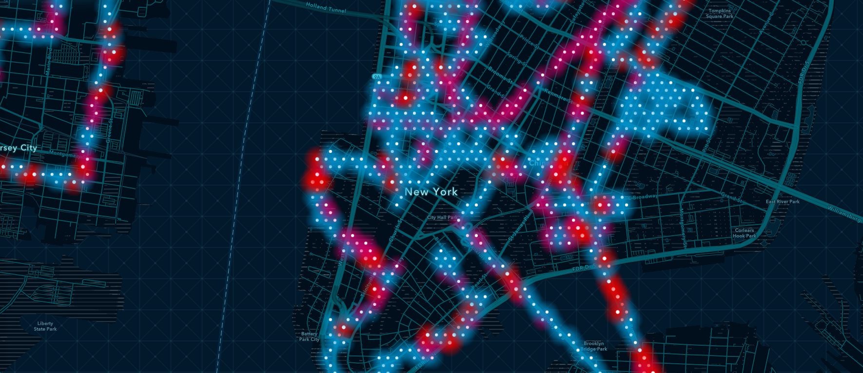
GEO-SPATIAL 5G COMMAND CENTER
Platform ZERO transforms complex 5G network performance data into a unified analytics ecosystem for network engineers, data scientists, and operations teams. Built to handle multi-source telemetry from SINR, RSRP, RootMetrics, and Tutela datasets across nationwide infrastructure.
This enterprise-grade dashboard enables real-time network monitoring, competitive benchmarking, and predictive maintenance through intuitive geo-spatial visualization and intelligent data layering.
- Unify fragmented network data sources into single source of truth
- Enable real-time competitive benchmarking via geo-spatial comparison
- Design scalable visualization architecture for nationwide coverage
- Reduce cognitive load through intelligent data layering and filtering

DATA PARALYSIS & FRAGMENTATION
Network operations teams were drowning in disconnected data streams from multiple vendors, geographies, and measurement systems. Without a unified view, critical network degradation went undetected, competitive insights remained hidden, and decision-making relied on incomplete information.
— Cognitive Overload
Engineers juggled 6+ separate dashboards with inconsistent metrics, taxonomies, and visualization standards—making cross-source analysis nearly impossible.
— Disjointed Workflows
No unified comparison tool meant manual data exports, spreadsheet wrangling, and hours lost reconciling Verizon vs. competitor performance across markets.
— Geospatial Confusion
Static map overlays lacked interactivity, hiding granular signal propagation patterns and terrain-specific network behavior critical for infrastructure planning.
— Accessibility Barriers
Dense data environments with fixed typography and color coding created readability issues for analysts working extended monitoring shifts in operations centers.
UNIFIED COMMAND CENTER
Build a single source of truth that consolidates SINR, RSRP, RootMetrics, and Tutela data into an intelligent geo-spatial dashboard. Enable drag-to-compare functionality, real-time competitive benchmarking, and terrain-aware 3D visualization while maintaining enterprise-grade scalability and accessibility.
STRATEGIC PILLARSUnified API orchestration normalizing multi-vendor telemetry into consistent data models. Automated ETL pipelines process SINR, RSRP, and third-party metrics every 15 minutes with sub-second query performance.
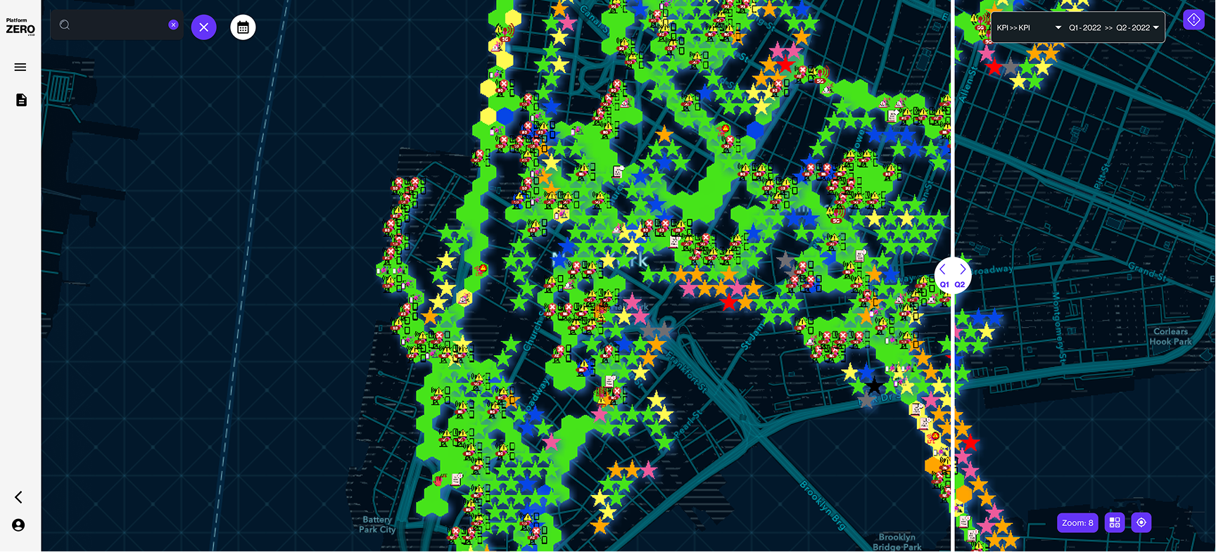
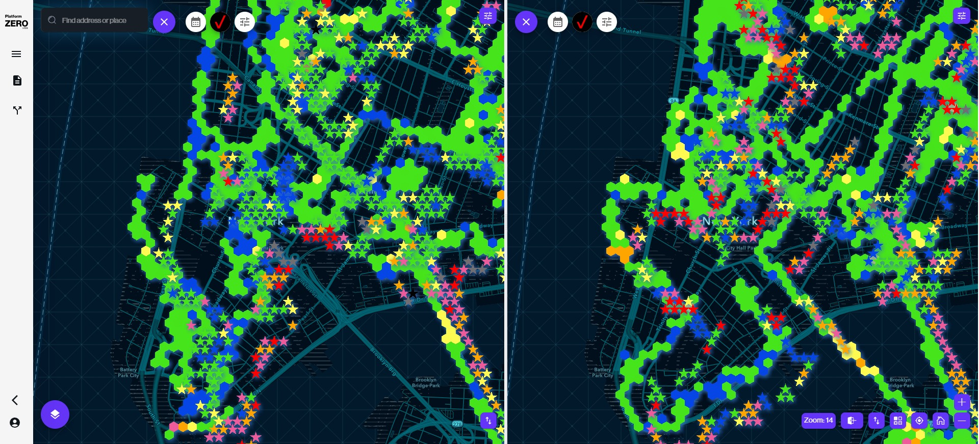
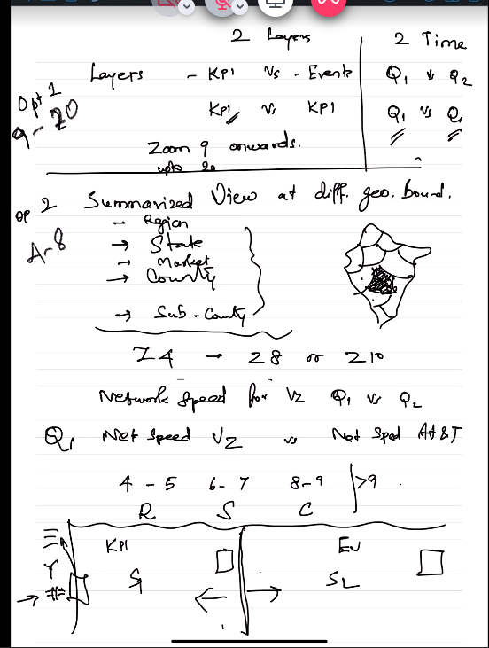
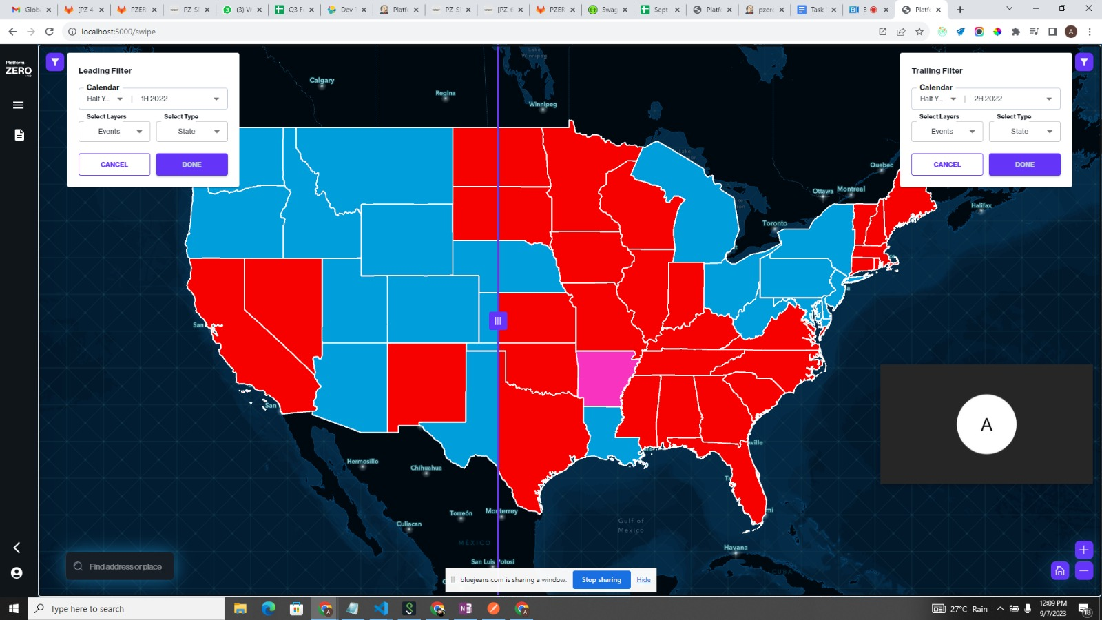
Interactive Geoswipe interface enabling side-by-side network performance analysis. Drag divider to instantly compare Verizon vs competitor coverage with synchronized map layers and metrics overlay.
WebGL-based terrain visualization mapping signal propagation across elevation data. Reveals how mountains, buildings, and geography impact 5G coverage patterns—insights impossible in 2D views.
User-controlled font scaling, 40-color KPI system for dense data differentiation, and high-contrast modes. Designed for 24/7 operations centers where visual fatigue impacts decision quality.

INTELLIGENT VISUALIZATION
& INTERACTION SYSTEMS
Platform ZERO delivers five breakthrough features designed to transform how network operations teams analyze 5G performance. Each capability addresses critical gaps in competitive analysis, spatial awareness, and data accessibility.
A / GEOSWIPE: DRAG-TO-COMPARE INTERFACE
Revolutionary side-by-side comparison tool enabling engineers to drag a vertical divider across synchronized map layers. Instantly reveals Verizon vs. competitor coverage disparities, signal strength deltas, and geographic blind spots. Transforms hours of manual analysis into seconds of visual insight.
B / 3D TERRAIN SIGNAL PROPAGATION
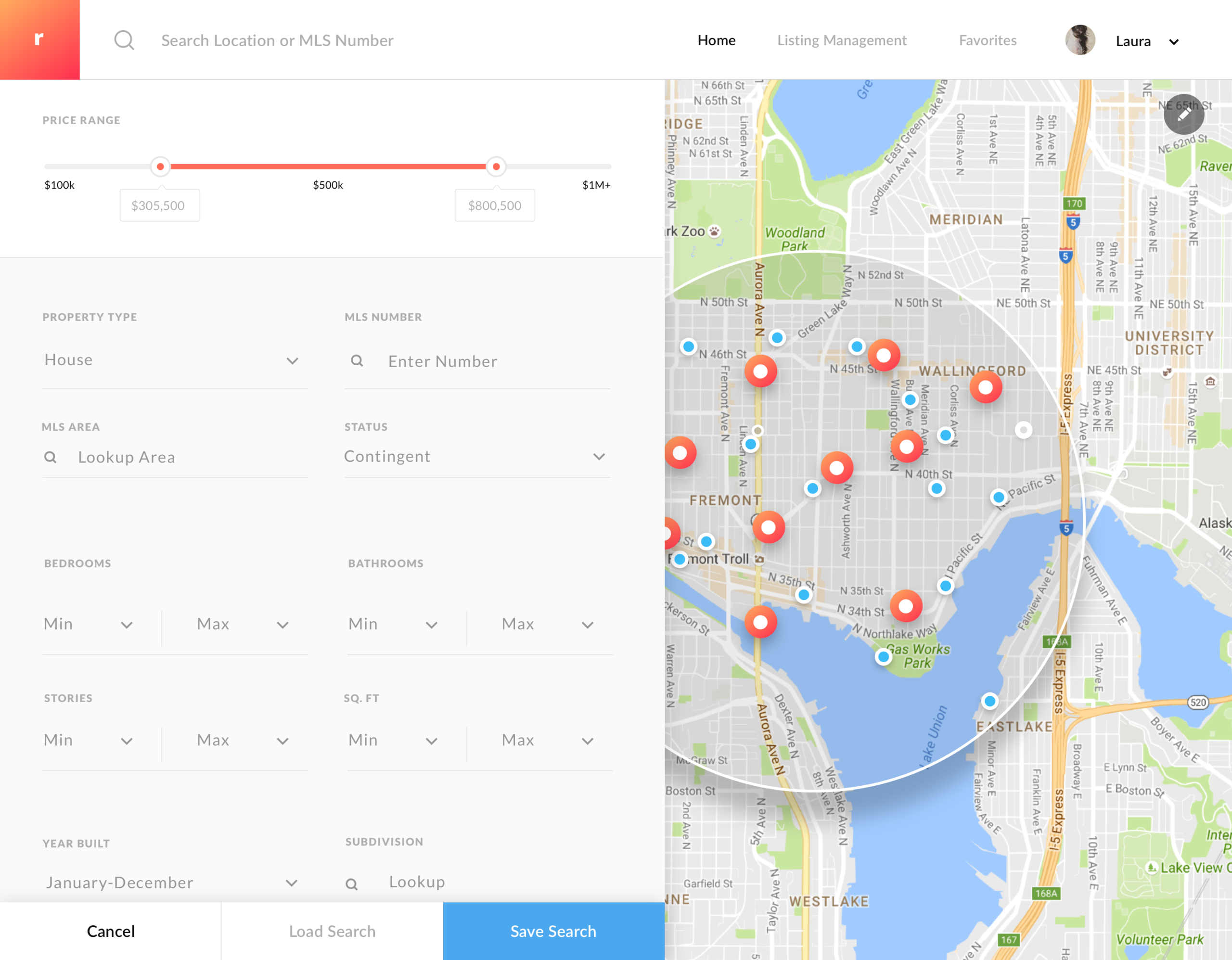
WebGL-powered 3D terrain visualization mapping real-world elevation, urban density, and geographic obstacles against 5G signal propagation. Reveals how mountains, buildings, and topography create coverage gaps—insights impossible to detect in traditional 2D heat maps. Critical for infrastructure planning and tower placement strategy.
C / 40-COLOR KPI SYSTEM
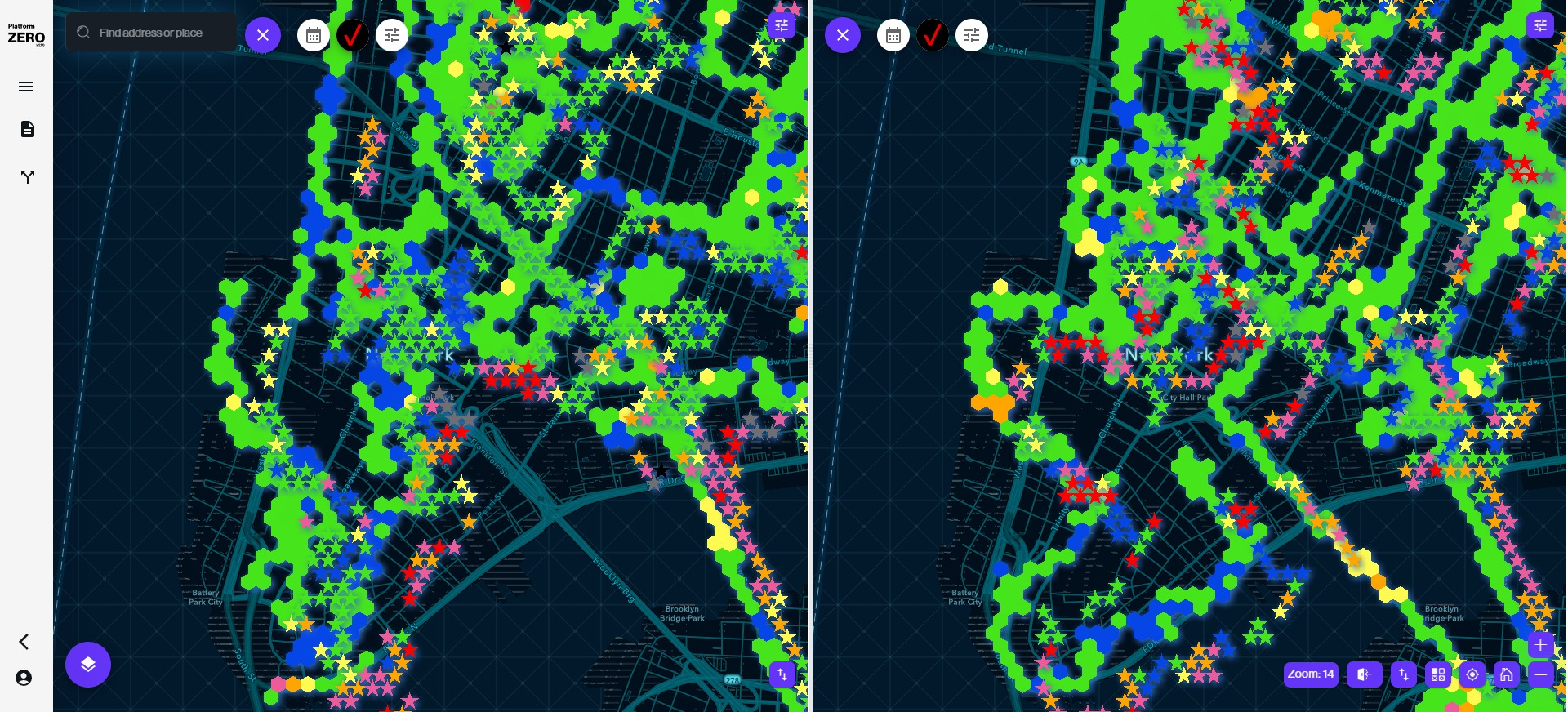
Purpose-built color palette engineered for dense data environments where standard 5-7 color systems fail. Enables simultaneous differentiation of 40+ KPI states across dashboards without cognitive overload. Each color scientifically calibrated for contrast, accessibility, and semantic meaning in network operations context.
D / ADAPTIVE FONT SCALING
User-controlled typography system enabling on-demand font size adjustment without breaking layout integrity. Designed for 24/7 operations centers where analysts work extended shifts monitoring critical infrastructure. Reduces eye strain, improves readability in varied lighting conditions, and ensures accessibility compliance beyond WCAG standards.
E / CONTEXTUAL FAILURE DIAGNOSTICS
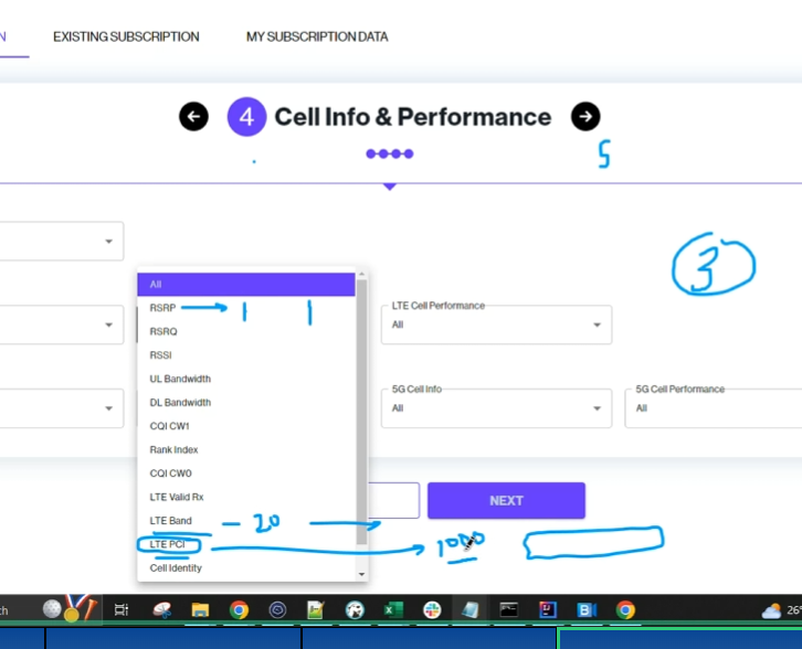
Intelligent modal system surfacing RSRP, RSRQ, and SINR diagnostics exactly when needed—not buried in navigation. Declutters primary dashboard while keeping critical troubleshooting data one click away. Reduces mean time to resolution (MTTR) by eliminating context switching between screens.
SCALABLE DESIGN FOUNDATIONS
Platform ZERO required a comprehensive design system capable of handling enterprise-scale complexity while maintaining visual clarity. Every component, color token, and interaction pattern was engineered for consistency, accessibility, and adaptability across nationwide infrastructure monitoring.
Light and dark mode variants optimized for different operational contexts—bright NOC environments vs dimmed control rooms. Maintains consistent data hierarchy across theme switches.
Scientifically calibrated color palette enabling simultaneous differentiation of 40+ network states. Each color tested for accessibility, semantic clarity, and perceptual uniqueness in dense dashboard environments.
Five-tier severity classification (Critical → High → Medium → Low → Info) with distinct color coding, iconography, and motion patterns. Ensures instant recognition of network health status.
Intelligent modal system surfacing contextual failure data, recommended actions, and root-cause analysis directly within the map interface. Eliminates tab-switching during critical incident response.
120+ modular components covering dashboard data tables, charts, maps, and navigation elements built for environments with large portfolios and multi-city deployments.
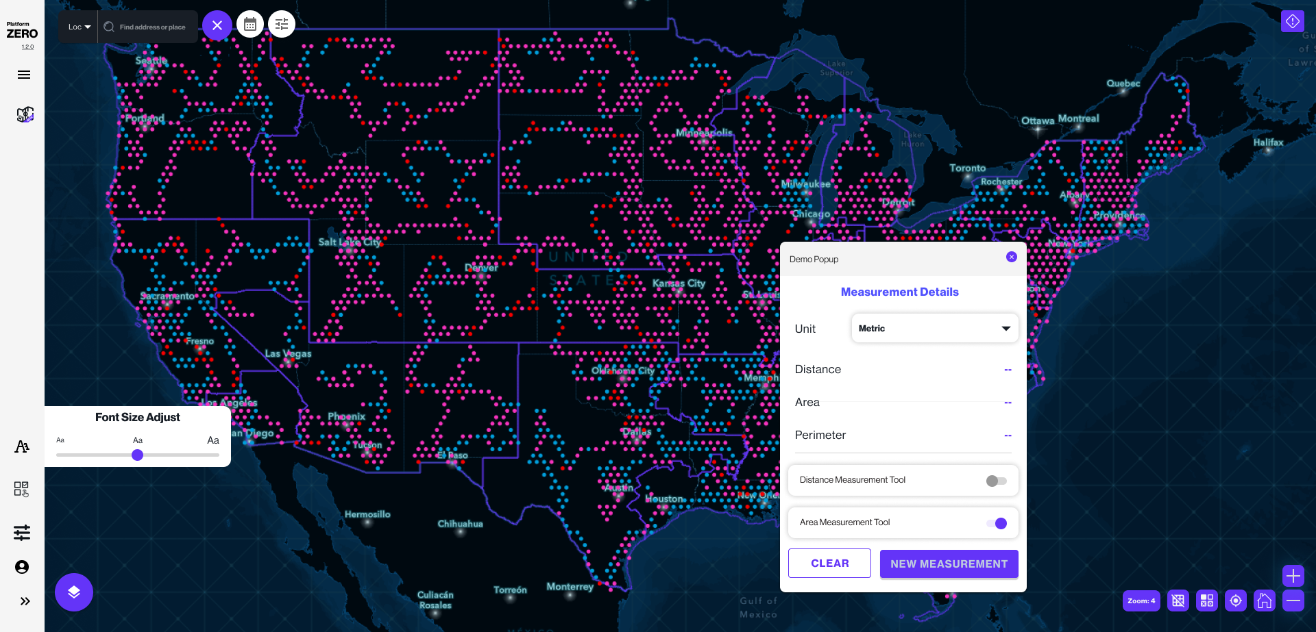
City-level and macro-level views of network metrics, geography, and failure patterns. Based on real telemetry from RootMetrics, SINR, and Tutela datasets.
User-controlled font scaling, high-contrast modes. Features a navigation, and motion-control customization. Data-fidelity: users can reduce density and simplify operational displays.
MEASURABLE OPERATIONAL GAINS
Platform ZERO deployment across Verizon's nationwide operations centers delivered immediate, quantifiable improvements in network monitoring efficiency, competitive intelligence gathering, and infrastructure decision-making velocity.
Unified dashboard eliminated context switching between tools, reducing mean time to resolution (MTTR) from 45 minutes to 12 minutes for network degradation incidents.
Consolidated 6 disparate vendor dashboards into single source of truth, eliminating manual data reconciliation across SINR, RSRP, RootMetrics, and Tutela sources.
Geoswipe comparison feature reduced competitive analysis workflows from 5 hours to 55 minutes, enabling daily market monitoring instead of weekly reports.
Operations teams across 12 regional NOCs adopted Platform ZERO within 30 days, citing accessibility features and intuitive navigation as primary drivers.
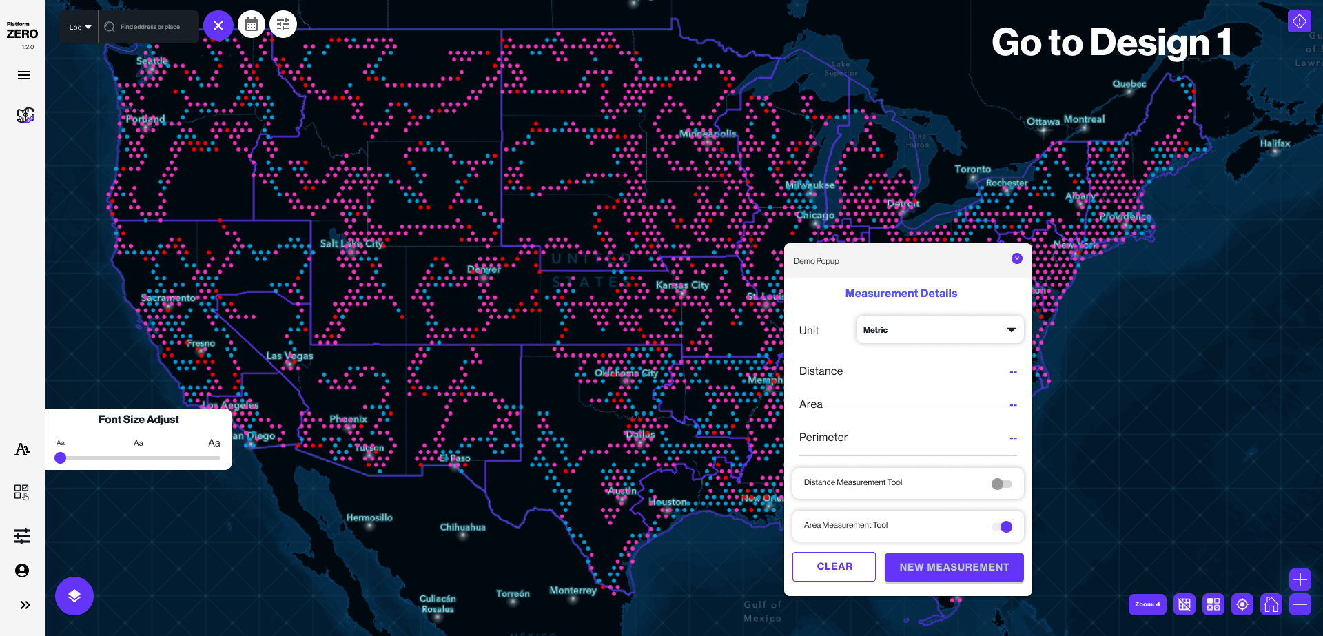
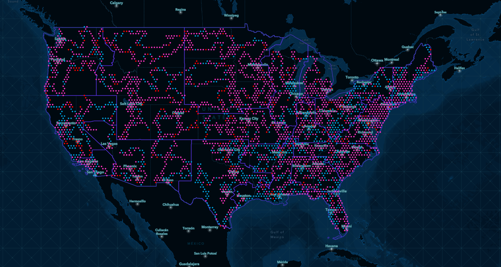
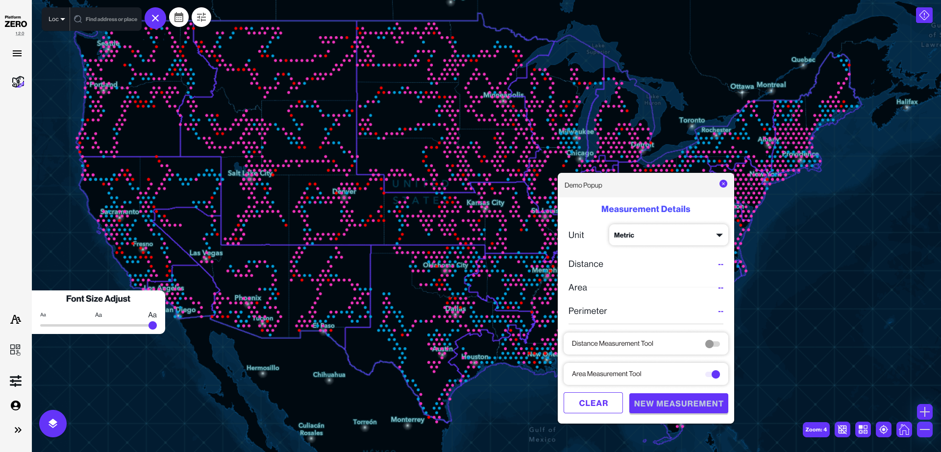
Nationwide 50-State Coverage Monitoring
Platform ZERO scaled to handle real-time telemetry from 50 states, 3,180+ counties, and 8,000+ individual cell sites—maintaining sub-second query performance at enterprise scale.

Real-Time Network Intelligence Dashboard
Live operational dashboards providing network engineers with instant visibility into signal strength (RSRP), quality (RSRQ), and interference (SINR) metrics across competitive carriers.
Enterprise-Scale Deployment Architecture
Deployed across 12 regional Network Operations Centers (NOCs) with role-based access, team-specific dashboards, and centralized administrative controls ensuring governance and security compliance.
KEY INSIGHTS & LEARNINGS
Platform ZERO proved that enterprise data visualization is fundamentally a systems design challenge—not just an interface problem. Success required simultaneous orchestration of data architecture, interaction design, visual hierarchy, accessibility engineering, and organizational change management.
The project reinforced the critical importance of designing for operators, not executives. While stakeholders wanted visually impressive dashboards, network engineers needed ruthlessly functional tools optimized for speed, accuracy, and cognitive efficiency during high-pressure incident response.
Most significantly, Platform ZERO demonstrated that accessibility in data-dense environments goes beyond WCAG compliance. True accessibility means user-controlled customization (font scaling, theme switching, layout density) that adapts to individual operator needs across extended monitoring shifts.
Design for Operators, Not Observers
Prioritize speed, accuracy, and cognitive efficiency over visual impressiveness. Network engineers need tools, not dashboards.
Scalability as First Principle
Enterprise systems must handle edge cases from day one—50-state coverage, 40+ KPI states, and real-time telemetry at scale.
Accessibility Beyond Compliance
WCAG standards are baseline. True accessibility means user-controlled customization for extended 24/7 operational contexts.
Systems Thinking in Design
Complex problems require design systems—not individual screens. Every component must serve the whole ecosystem.
Platform ZERO transformed how Verizon monitors nationwide 5G infrastructure—consolidating fragmented data streams into a unified command center that empowers network engineers with actionable intelligence. This project exemplifies my approach to enterprise UX: systems-driven, data-informed, accessibility-first design that delivers measurable operational value.